Friday, July 27, 2012

Font Hate Friday: Bleeding Cowboys


Fontname: Bleeding Cowboys
This is a newer font I have been seeing around, and I liked the first time I saw it, sort of. Slight tremors of distaste.  Later, I figured out why it soured my stomach. It embodies this:
A dyejob-blonde clubgirl from the suburbs wearing a just-purchased faux stetson with a badly-tooled silver doodahs on it, in fake cowboy boots drinking half-price rail-pour margaritas, trying to line-dance to a Toby Keith techo remix at a Chaamps "dance-floor". Utter Vapidity.
It's also deplorably stuck in the 90's, back when the new Fonts on the Block were all about "grunge" and "swoosh". I mean yes, pushing the envelope of electronic typography is one thing, yes we learned to how to use variable width letterforms and track them so the non swoosh letterform was kindof aligned (notice P-A-R, and shudder), and yes, not all fonts need to be simple black fills, yes.

But seriously, this is just offensive to the eye. It looks like how a hangover tastes. Do yourself a favor and gun this sucker down at high noon.

Found with: Eyeball!
Available at: NO. Just no.

Nausea Rating: 3

Friday, July 20, 2012

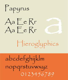
Font Hate Friday: Papyrus


This bastard sets my teeth on edge.

"Oh look, let's have a roughened edge! It looks JUST like you wrote it on papyrus!"
"Aren't I clever? What a creative font!"
"Let's use super loopy decenders because we're at one with the universe!"
"Let's offset the upper and lowercase baselines to align our chakras!"
"Let's make sure it's virtually unreadable at screen size because of the mystery of the universe!"

You know that feeling you get when you have an eyelid flipped up, and it's scratchy and pinchy at the same time?  That is Papyrus in a nutshell.

This font has come to embody insincerity to me, for the simple reason that it's used heavily by the Homeopathic Wellness / Cystaltherapy / Woo-Woo Therapy storefront crowd. Seems like 80% of those places I see use it to push their bogus/harmful cures. It just boggles me that someone would fall for that nonsense - and in the same breath - use this font. My immediate thought is: if they consciously thought that this was a nice font to use - it indicates a serious inability to think critically.

That said, another terrible thing about this font is its apparent seductiveness. Lately I have seen it used for other types of business, and honestly, I refuse to patronize them. The font just screams "FRAUD!" to me. So if you're a designer, old or young - avoid this siren seductress, she may promise you etherial design in song, but you'll get the typeface equivalent to dysentery.

Worst thing about this font: It was used for the movie "Serenity", and is even shown painted ON the Serenity herself. If I was an Alliance Design-Commander, I'd order my Typography Capital Ship to blow that damn ship out of the 'Verse. -1 Joss-love points.

Found with: Eyeball!
Available at: Wherever crap is sold.

Nausea Rating: 4.5


Friday, June 29, 2012

Harbor Freight Tools


Antique Olive Nord:

Found with: Eyeball!
Available at: http://www.identifont.com/show?6M2

got milk?


Phenix American:


Found with: http://fontmeme.com/got-milk-font/
Available at: http://www.myfonts.com/fonts/mti/phenix-american/

The Google


Catull (Catull Pro Regular, Catell BQ, Catell BE):

Found with: What The Font!
Available at: http://www.myfonts.com/fonts/berthold/catull-pro/

Monopoly


ITC Kabel:

Found with: Eyeball!
Available at: http://www.myfonts.com/fonts/linotype/itc-kabel/

Leonard Cohen


OL Smokler Bold:

Found with: Identifont
Available At: http://www.identifont.com/link?BMUKWV+1T70