This bastard sets my teeth on edge.
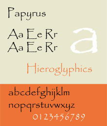
"Oh look, let's have a roughened edge! It looks JUST like you wrote it on papyrus!"
"Aren't I clever? What a creative font!"
"Let's use super loopy decenders because we're at one with the universe!"
"Let's offset the upper and lowercase baselines to align our chakras!"
"Let's make sure it's virtually unreadable at screen size because of the mystery of the universe!"
You know that feeling you get when you have an eyelid flipped up, and it's scratchy and pinchy at the same time? That is Papyrus in a nutshell.
This font has come to embody insincerity to me, for the simple reason that it's used heavily by the Homeopathic Wellness / Cystaltherapy / Woo-Woo Therapy storefront crowd. Seems like 80% of those places I see use it to push their bogus/harmful cures. It just boggles me that someone would fall for that nonsense - and in the same breath - use this font. My immediate thought is: if they consciously thought that this was a nice font to use - it indicates a serious inability to think critically.
That said, another terrible thing about this font is its apparent seductiveness. Lately I have seen it used for other types of business, and honestly, I refuse to patronize them. The font just screams "FRAUD!" to me. So if you're a designer, old or young - avoid this siren seductress, she may promise you etherial design in song, but you'll get the typeface equivalent to dysentery.
Worst thing about this font: It was used for the movie "Serenity", and is even shown painted ON the Serenity herself. If I was an Alliance Design-Commander, I'd order my Typography Capital Ship to blow that damn ship out of the 'Verse. -1 Joss-love points.
Found with: Eyeball!
Available at: Wherever crap is sold.
Nausea Rating: 4.5


No comments:
Post a Comment